HELPFUL TIPS AND TRICKS
Here we have some tips and tricks to remember when creating layouts and designs.
As this guide forms the foundation for all communication measures and ensures quality and professionalism. We also want it to inspire creativity when working in the brand system.
Design with pace
Pace in design refers to how rhythm and flow guide the viewer's experience.
A layout with consistent spacing, varied content blocks, and intentional pauses can help users absorb information without feeling overwhelmed.
Quick, punchy formats-like social posts or event flyers-benefit from bold contrasts and tight compositions, while longer formats need breathing room and visual breaks to maintain engagement.
Designing with pace means thinking about how the eye moves, when to slow down, and when to energize.
Balance consistency with flexibility
A strong brand identity thrives on consistency, but it also needs room to breathe.
Designers should adhere to core elements like color palettes, typography, and logo usage, while feeling empowered to adapt layouts and styles to suit different platforms or audiences. For example, a social media post might lean into bold, expressive visuals, whereas a corporate document may require restraint and clarity.
The goal is to maintain brand recognition while allowing for creative expression that fits the moment.
Hierarchy is key
Visual hierarchy guides the viewer's attention and helps them navigate information effortlessly.
Designers should use scale, spacing, and contrast to establish clear relationships between elements, thus making it obvious what's most important and what supports it.
Whether it's a headline that commands attention or a call-to-action that needs to stand out, thoughtful hierarchy ensures that content is not just seen, but understood.
Use color with purpose
Color is one of the most powerful tools in a designer's kit, and it should always be used with intention.
Each brand color can carry emotional weight or functional meaning; Mallard might convey trust, while Moderna suggests energy.
Designers should consider how color choices support the message and mood ofthe piece, and ensure accessibility by maintaining strong contrast and legibility.
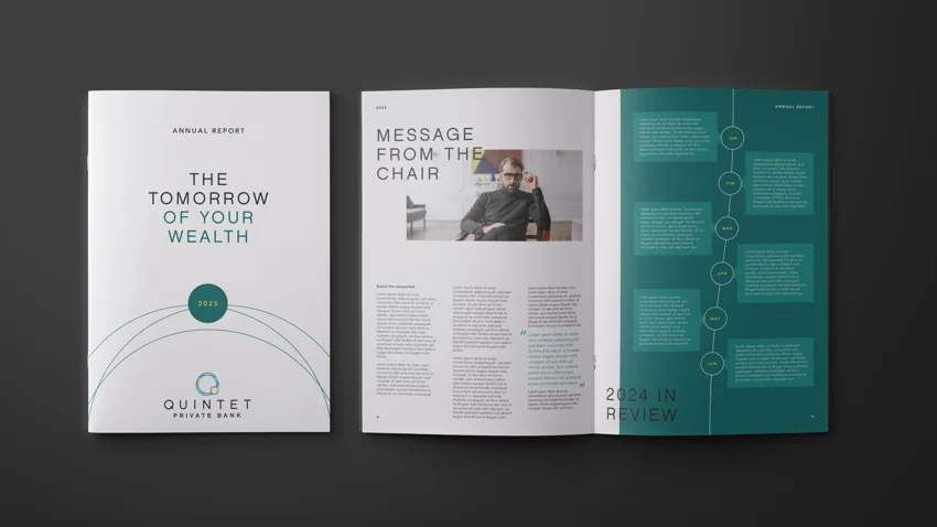
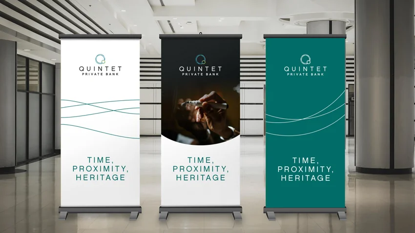
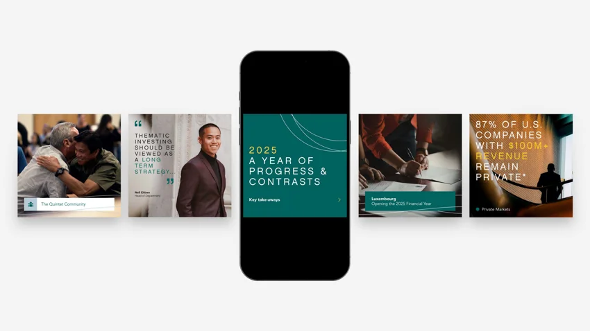
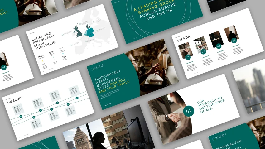
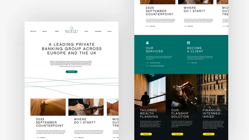
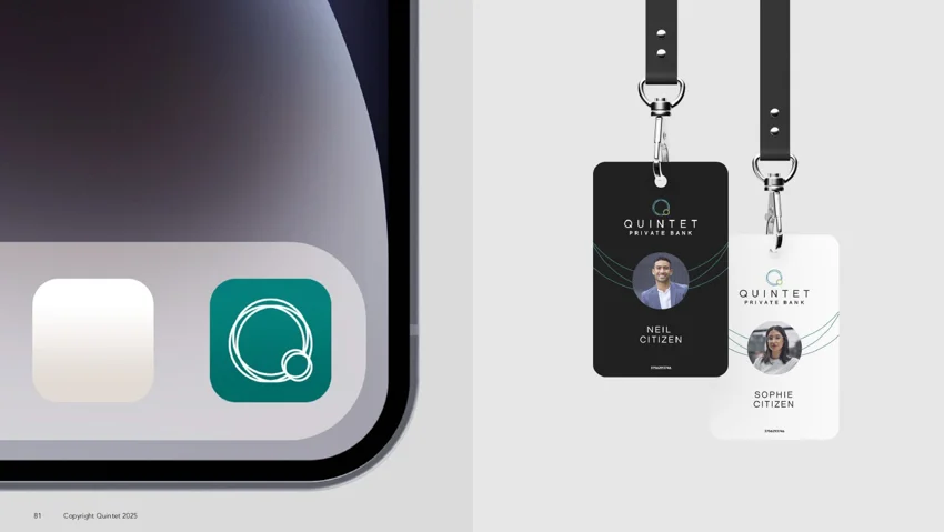
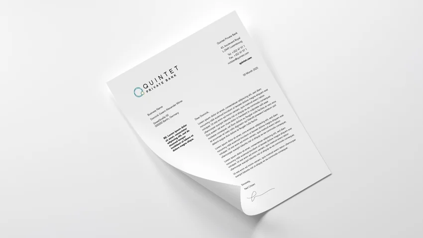
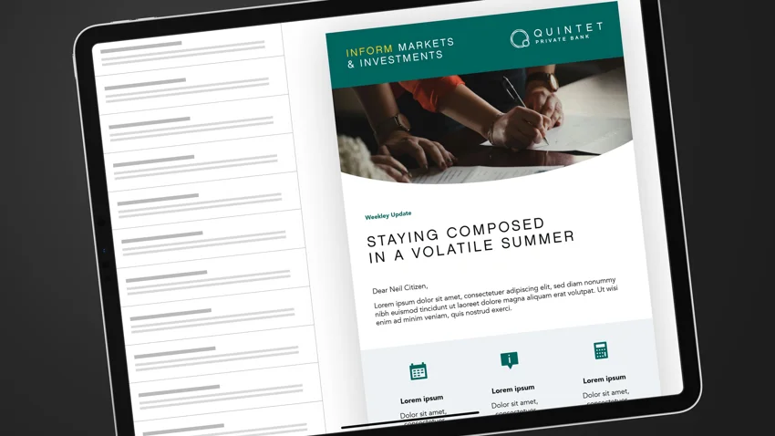
BRAND INSPIRATION
Here you'll find a collection of visual examples that bring our brand to life. Each layout is not limited to the context in these examples. You may find that a layout inspiration you need for a publication may be found below in a roll-up.