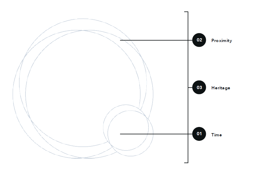
TIME PROXIMITY HERITAGE AT THE CORE OF ALL WE DO
Time, proximity and heritage translates directly into our core visual for Quintet. Enhancing each of the brand core values within this system.
Performance is delivered through a logically crafted layout system that pairs with the organic movement stemming from our icon's essence. Paired together creates a system that celebrates simplicity and elegance in every touch point.
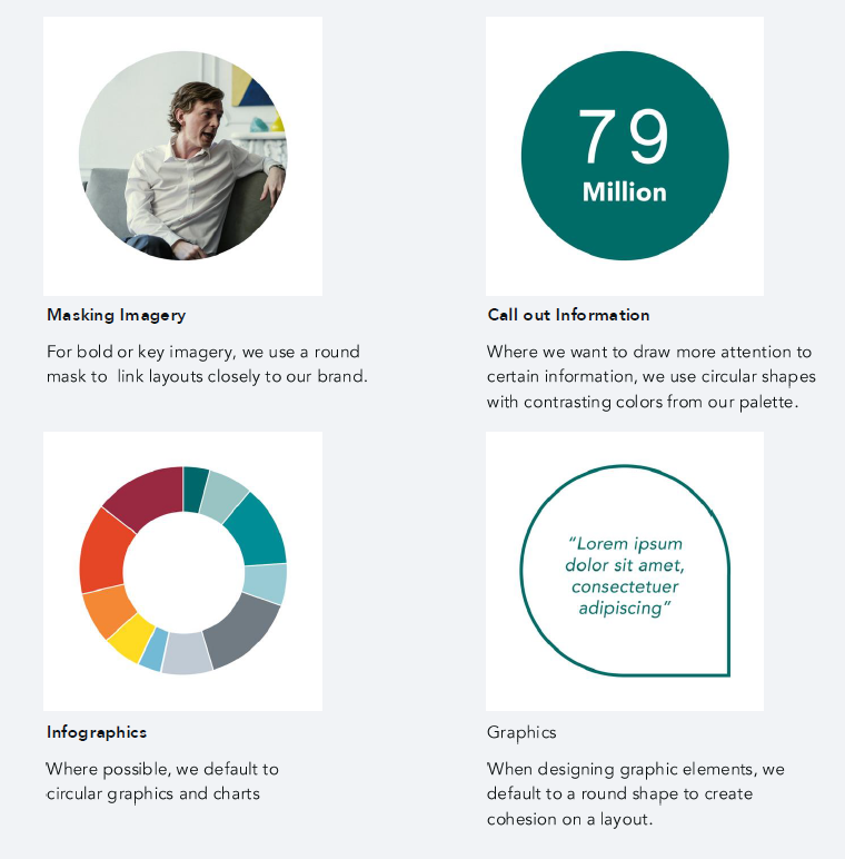
TlME: OUR FOCUS
Much like the focus point on our icon, we have taken the circular holding shape and continue to use it as our content's focus point.
We can use this in a variety of ways to draw attention to our content. The following are some examples of treatments you can use in layouts to highlight information and draw focus.
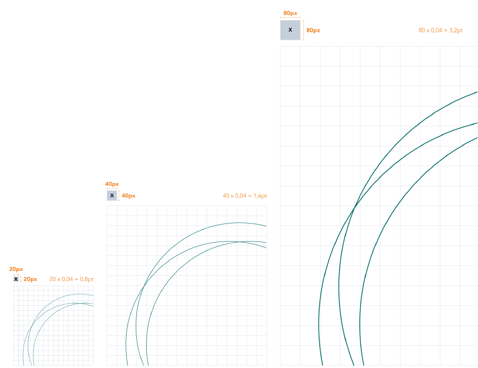
PROXIMITY: OUR ESSENCE
We take the overlapping segments of our icon and create our brand essence; our proximity lines.
These lines are used to add a strong brand presence to our layouts and to infuse elegance into our touch points. While they don't need to be present on every layout, we have various treatments that you can take advantage of.
Our proximity lines never overlap or clash with other content - excluding photography - because, like our brand, it exists in harmony with our content.
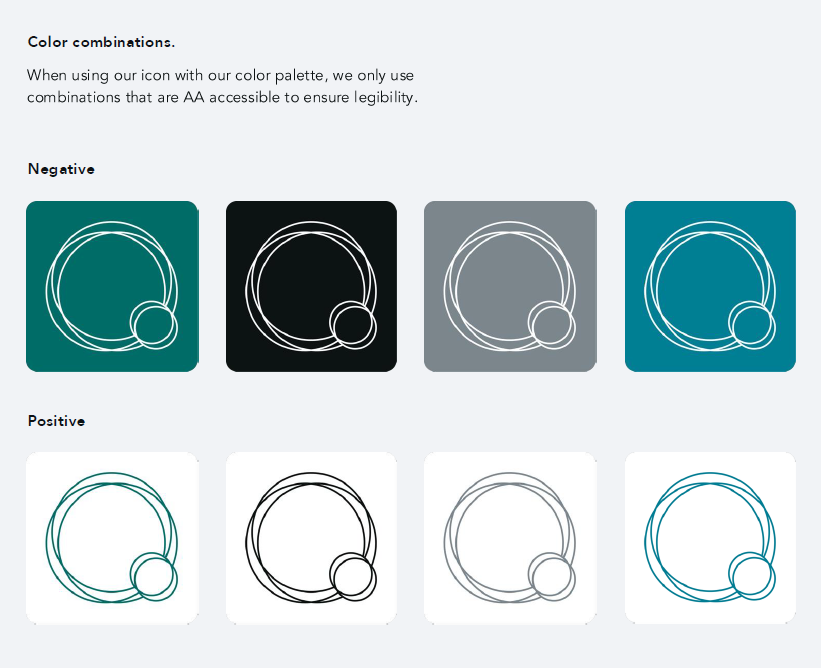
HERITAGE: OUR ICON
A unique icon is a powerful asset within a brand armoury, bringing a sense of movement and feeling to complement the name, as well as working as a visual identifier in places where relying on words alone is less powerful.
Our icon is inspired by sound waves - what the sound a Quintet makes looks like.
We only use our icon where our logo can't be applied and it is always used with functional purpose - never decoration (i.e an app icon).
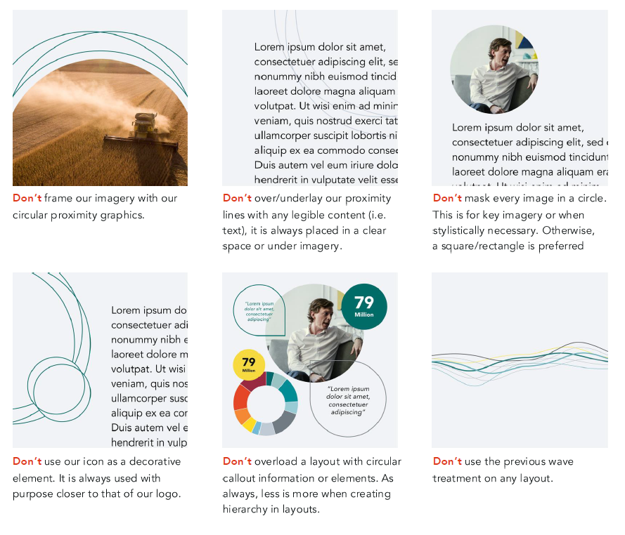
TlME, PROXIMITY AND HERITAGE DON'TS
Ensure the following so core graphic elements always looks their best.